2014
Switzerland may be one of Western Europe’s smaller countries – and one that doesn’t always take the spotlight like its French, German and Italian neighbours – but it has had a big-time influence in the world of graphic design.
You’re likely already familiar with the hallmarks of Swiss graphic design – namely a sharp attention to detail (how stereotypically Swiss is that?), minimalism and – perhaps its telltale feature – crisp, clear and prominent sans-serif lettering.
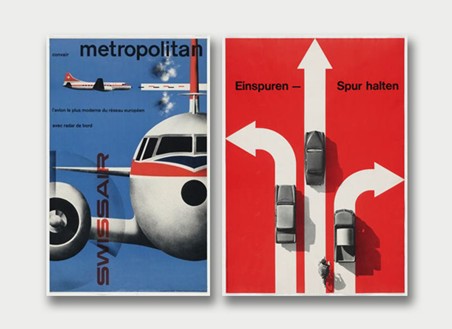
Check out this excellent example of what Swiss designers – and those following their lead – do best.

Image VIA Zeldman.com
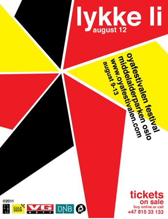
Interestingly enough, what is now known as the Swiss school of graphic design had its roots in Russian, Germany and the Netherlands in the first decades of the 20th century. The Swiss style then came to the international forefront of international design in the 1950s, and has been there ever since.

Image VIA Sharpiro Design
If you boil it down, Swiss graphic design can be seen as an authentic pursuit of beauty and – most importantly – simplicity when it comes to design. While other styles of design go for splashy and robust ideas such as elaborate textures and complex visual layouts, the Swiss prefer something much more simple.
In the art world, they’re a prime example of the minimalist philosophy. The resulting emotions and ideas this design tack gets across include confident, boldness, sleekness and, above all, pure class (once again, how Swiss is that?).
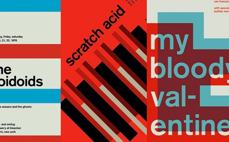
And it’s no wonder why Swiss design has become a global phenomenon. The minimal design approach is very versatile and can be refashioned for so many purposes, from commercial airlines to concert posters.

Image VIA CDN1.com
The ethos is this: do more with less. Don’t add when you can subtract. Swiss graphic design is also indebted to mathematics and especially geometrical shapes (think clean, cool lines). The result is a well-structured design style that uses empty space as well as logos and images.
Swiss style prides itself on the following ideas and features:
- Functionalism and practicality
- Simple use of objects (logos, images, etc.)
- Crisp and clean geometry
- Sans-serif fonts (made of straight lines and no curly or curvy projections or extensions on the edges of letters)
Above all else, Swiss style is superb at getting information across without confusion or obstruction. In that respect, it is one of the most efficient (and intellectually pleasing) schools of modern design that maximizes the impact of a minimal visual layout.
 Recent Posts
- 5 Things to Consider When Packaging Food
- How Does Hot Foil Stamping Work?
- 5 Tips for Monochrome Packing
- How To Choose The Right Boxes For Your Business
- What Type of Information Is Legally Required for Package Design?
 Categories
- Announcements
- Company Information
- Frequently Asked Questions
- General Category
- Goldrich
- Newsletter Articles
- Product News
- Testimonials
Deprecated: Function wp_list_cats is deprecated since version 2.1.0! Use wp_list_categories() instead. in /home/goldpakcom/public_html/wp-includes/functions.php on line 6121
 Archives
- March 2015
- February 2015
- January 2015
- December 2014
- November 2014
- October 2014
- September 2014
- August 2014
- July 2014
- June 2014
- May 2014
- April 2014
- February 2014
- January 2014
- November 2013
- October 2013
- September 2013
- July 2013
- June 2013
- May 2013
- April 2013
- March 2013

 Proudly Canadian Since 1953