2015
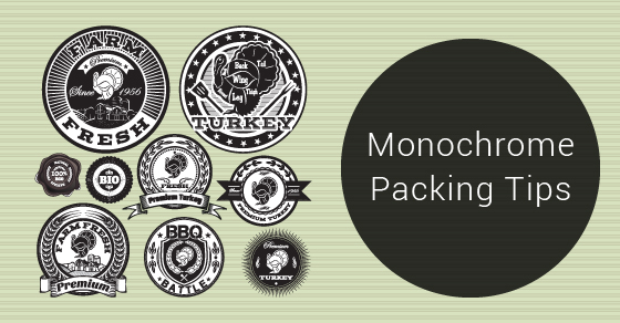
Monochrome packaging is an attractive choice for companies for more than a few reasons.

Monochrome color schemes save money on color printing, reducing your cost per product. It also looks attractive to consumers, helps the environment, and is also more accessible for color blind people who have difficulty reading colored text.
If you’re interested in introducing monochrome packing to your products, here’s how to make the best of it:
- Consider white-on-black instead of black-on-white.
- Use grey sparingly.
- Take ideas from major companies with monochrome packaging.
- Use modern typeface.
- Convert your logo.
Black-on-white runs the risk of looking plain or generic, but white-on-black looks powerful and luxurious.
According to color psychology, customers who see black packaging are more likely to think that the product is valuable or high-class. Customers who then see the low price you managed, due to the costs you saved on box printing, will feel that they are getting a deal.
Even better, black packaging creates an air of mystery, so customers are more likely to take your product off the shelf in order to see what it is.
Acknowledging shades of grey is great in life, but not in design. Grey should be used sparingly to add visual complexity to the background of your packaging.
For all text and major images, though, use bright contrasting white. Hard edges between white and black are dramatic, eye-catching, and chic.
Monochrome is still new and unusual on a mainstream scale, but a few major companies have been embracing it for years.
Chanel and Jack Daniels have become known for the aesthetic over the years. Other middle and top-shelf liquors apply the look to whole bottles in order to better convey their value, like Black Vodka and Lock, Stock, and Barrel.
If you take a look at all the products above, you’ll probably notice that Jack Daniels looks the least high-end, while Chanel looks the most. This is because Jack Daniels has the highest density of detail, while Chanel has the least. You can use this to scale your packaging to the right balance of classy versus intimidating.
Typeface ages quickly. Times New Roman was common a decade ago, but now it just looks old and lazy. If you can, have your designer create a modern typeface inspired by newer Sans-Serif variants or other modern choices. If you can’t afford this, ask your designer to download a custom free typeface.
Don’t just switch your logo over the grayscale. Have it redrawn to make the best use of stark contrasts between black and white. This will make your product look much more professional, and make your brand look more resourceful.
 Recent Posts
- 5 Things to Consider When Packaging Food
- How Does Hot Foil Stamping Work?
- 5 Tips for Monochrome Packing
- How To Choose The Right Boxes For Your Business
- What Type of Information Is Legally Required for Package Design?
 Categories
- Announcements
- Company Information
- Frequently Asked Questions
- General Category
- Goldrich
- Newsletter Articles
- Product News
- Testimonials
Deprecated: Function wp_list_cats is deprecated since version 2.1.0! Use wp_list_categories() instead. in /home/goldpakcom/public_html/wp-includes/functions.php on line 6121
 Archives
- March 2015
- February 2015
- January 2015
- December 2014
- November 2014
- October 2014
- September 2014
- August 2014
- July 2014
- June 2014
- May 2014
- April 2014
- February 2014
- January 2014
- November 2013
- October 2013
- September 2013
- July 2013
- June 2013
- May 2013
- April 2013
- March 2013

 Proudly Canadian Since 1953