2014
In a crowded market filled with many competing products, good product design is a not-so-secret weapon that can help your brand stand out.
There’s a fine line between designing packaging that breaks the mold and packaging that gets overlooked.
Good designers know how to capture the eye of their target audience. We’ve rounded up five examples of packages that take creativity to the next level.
1. Dazzling Sushi Packs

There’s something about repeating patterns that our eyes can’t help but look at! Designers Kinetic Singapore take advantage of this with their eye-popping packages for local sushi purveyors. The funky food patterns on the wraps are natural attention grabbers.
2. Not Your Mother’s Tupperware

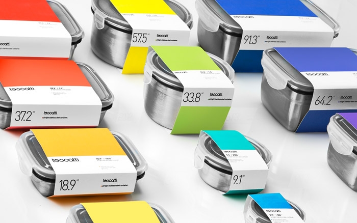
This line of unique food containers from Toscatti dazzle with the eye-grabbing colours on their packaging. Designed by Anagrama, they help the commodity product stand out on a busy shelf of rival Tupperwares.
3. Crave-Ready Candy

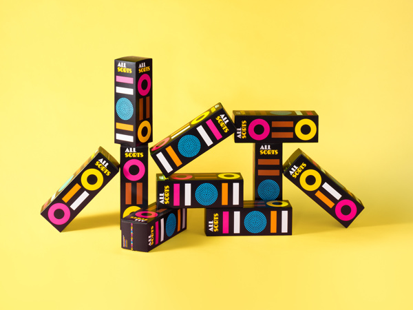
This is a good case study in the importance of product design. A major Nordic candy maker needed some help making its products – a commodity in a crowded market – stand out. They turned to Finnish designers Bond Creative, who cooked up packaging with distinct shapes and colours that expertly mirror the sweets they contain within.
4. Stand-Out Organic Food Branding

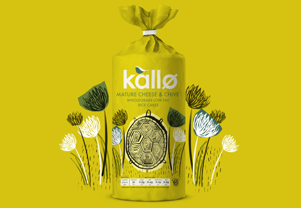
This crisp and clean packaging for an organic food company uses colour theory well. Note all the shades of calming colour, blue that seem to carry a bit of whimsy with them. Designed by UK firm Big Fish, the packaging is minimal but carries fun-filled illustrations, and even bits of poetry. What’s more, they stick to the food’s brand by having soothing colours which carry a handmade feel. The latter is thanks to the traditional techniques used in the product’s design and creation, such as lino printing.
5. MAD Danish Beer

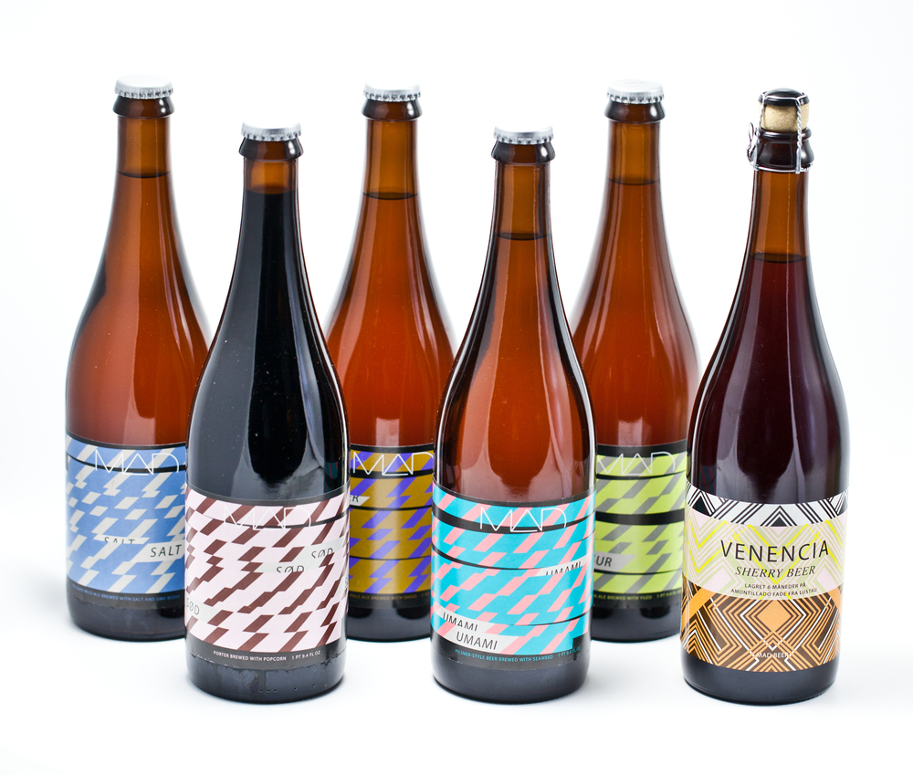
Don’t try to adjust the picture on your set when viewing these far-out beer bottles. This line of brews, dubbed MAD Beer, are the result of a collaboration between a Danish brewer and chef. But it’s designer Keith Shore who deserves a drink for coming up with the uniquely horizontal bottle design.
6. Stranger & Stranger Spirit No. 13
Taking something out of its element and still having it look in-place is one of the hardest things for a graphic designer to do, but that’s exactly what the designers at Stranger & Stranger have accomplished with their unique bottle design. Bringing brown bagged booze to a chic event has never seemed more appropriate thanks to this expertly executed twist on a low-bro tradition.
 Recent Posts
- 5 Things to Consider When Packaging Food
- How Does Hot Foil Stamping Work?
- 5 Tips for Monochrome Packing
- How To Choose The Right Boxes For Your Business
- What Type of Information Is Legally Required for Package Design?
 Categories
- Announcements
- Company Information
- Frequently Asked Questions
- General Category
- Goldrich
- Newsletter Articles
- Product News
- Testimonials
Deprecated: Function wp_list_cats is deprecated since version 2.1.0! Use wp_list_categories() instead. in /home/goldpakcom/public_html/wp-includes/functions.php on line 6121
 Archives
- March 2015
- February 2015
- January 2015
- December 2014
- November 2014
- October 2014
- September 2014
- August 2014
- July 2014
- June 2014
- May 2014
- April 2014
- February 2014
- January 2014
- November 2013
- October 2013
- September 2013
- July 2013
- June 2013
- May 2013
- April 2013
- March 2013

 Proudly Canadian Since 1953